The Pharmammouth pharmacy project
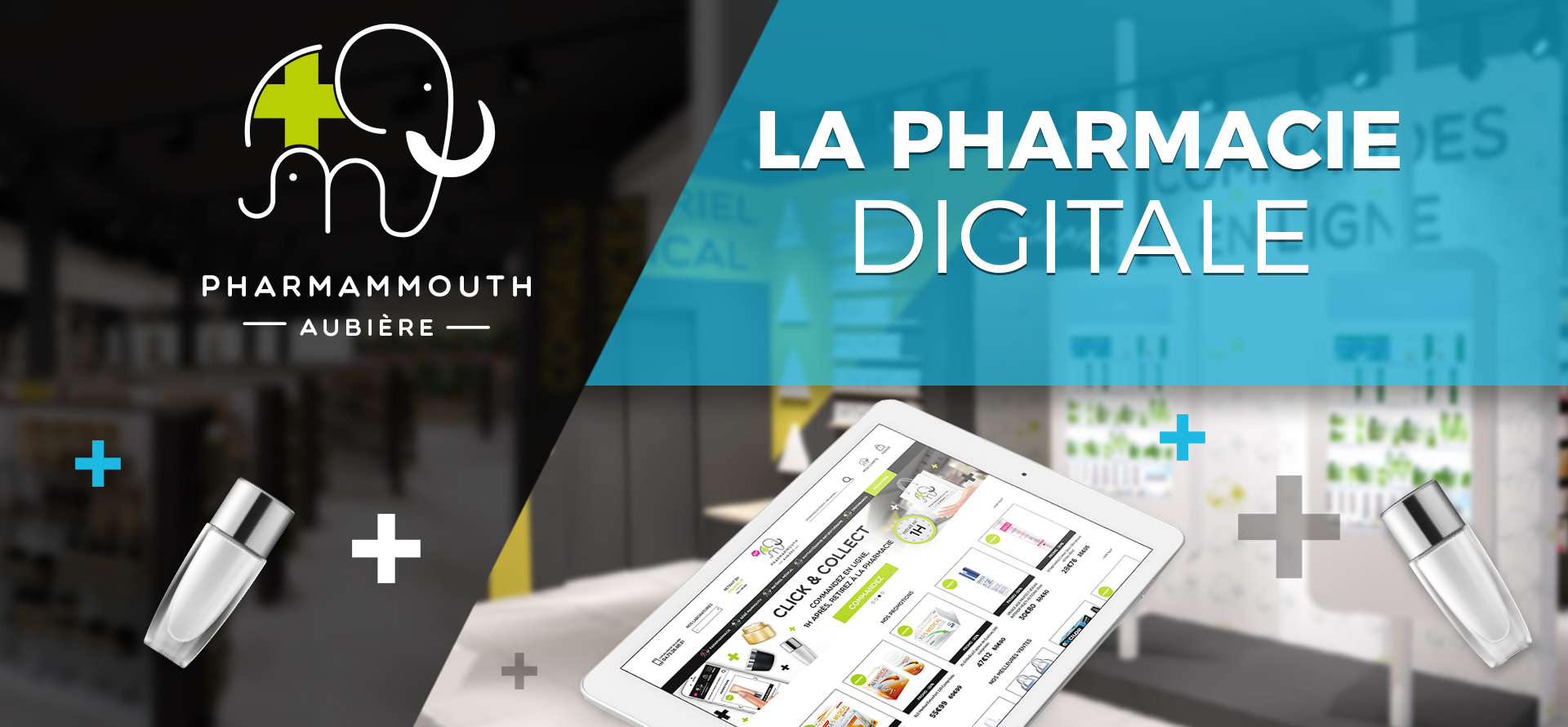
To revitalize its online business and attract new customers to its pharmacies, the pharmacy Pharmammouth in Aubière (63) called on our creative and web design services. This was an opportunity for Itekpharma to bring together as many features as possible to make an online pharmacy a success.
Pharmammouth is a pharmacy located in the Auchan shopping center in Aubière, formerly the Mammouth supermarket. Its roots must be preserved, as they are part of its identity. So the first challenge was to migrate the pharma2m.com site to pharamammouth.com, in order to offer pharmacy customers and other Internet users an up-to-date e-commerce experience.
This is in line with the desire of the 2 co-founders, Aurélien and Baptiste, to make their pharmacy a flagship of modern, innovation-oriented pharmacy.
With its 700m² sales area and 12 counter counters, the Pharmammouth pharmacy now serves more than 800 customers a day, and boasts a product catalog of over 10,000 items. With new layouts and a reworked scenography to meet the needs and purchasing habits of the patient base, it was necessary to have a site in tune with these transformations.
Strategic e-commerce functionalities
ITEKPHARMA offered its e-commerce expertise to the Pharmammouth.com website, particularly in terms of drive-to-store and web-to-store.
The online prescription module lets you scan or photograph your prescription and send it directly to Pharmammouth, via a secure server for health data.
ITEKPHARMA has also integrated a Click & Collect system into the site, so that customers can order online and collect their purchases from the pharmacy 1 hour later at a dedicated "express" counter.
An intelligent internal search engine enables users to find a specific product and its preferred brands more quickly, once again with the aim of facilitating the shopping experience.
ITEKPHARMA's services also include strategic webmarketing actions: SEO, Google Shopping, sales events (promotions, new products, events...), creation of competitions, community animation on social networks, newsletters, SMS campaignspoint-of-sale displays, flyers and goodies.
The design concept
To embrace the new dynamic, the brand identity also had to be given particular attention. In particular, the logo was the subject of in-depth work, in order to set the site apart from traditional pharmacy practices, with an iconographic and offbeat design.
The logo features the mammoth emblem, but is staged in a family-friendly, protective way to reassure visitors, while containing the letters P and M as a reminder of the initials. The logo's cross is in aniseed green, again in a bid to break away from classic pharmacy design, while softening the vision.
Don't hesitate to consult our presentation and participation to the Palmes de la Com' 2018, by following this link.

