Pharmacy logos before digital
Historically, it has always been very difficult to distinguish the logo and brand image of one pharmacy from another. Green cross, caduceus, white coats... The image of a pharmacy to the general public was standardized, offering no opportunity to stand out and assert the identity of the pharmacy and the pharmacists who run it. Reassurance or the trend of the time, the observation remained the same: it's hard to stand out from the competition via your logo and brand image when you're a pharmacy.
Fortunately, times are changing, mentalities are evolving and expert support is becoming increasingly important.

Pharmacy logos after digital
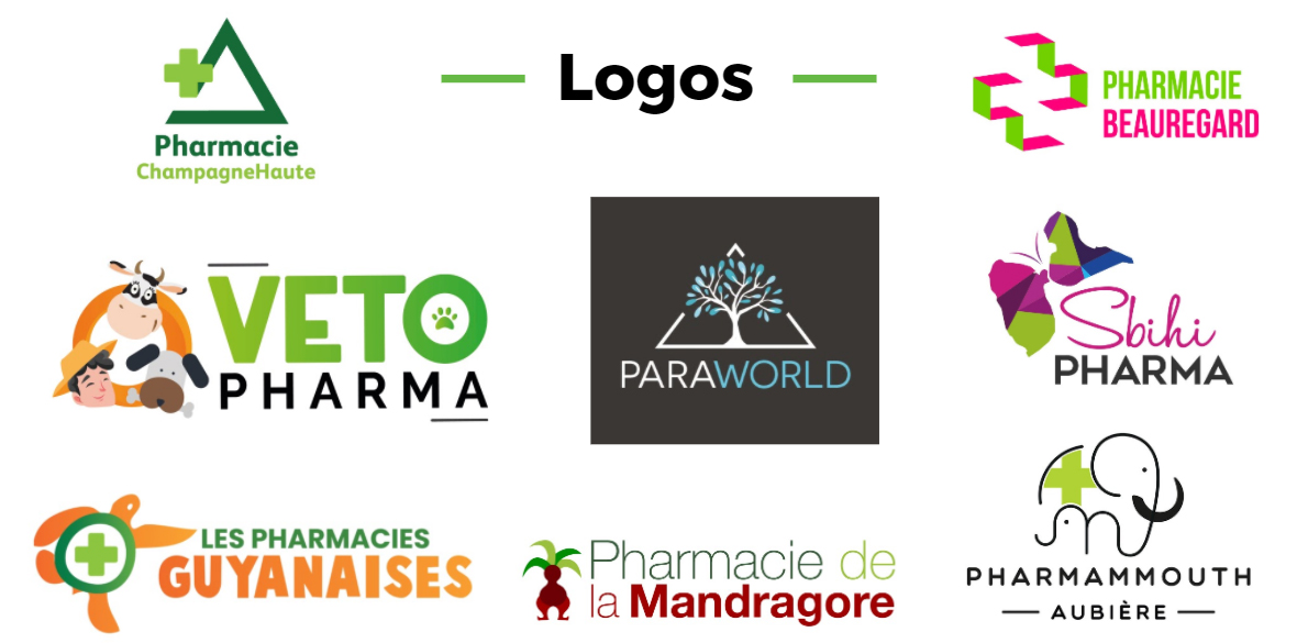
The arrival of the web in pharmacy has prompted pharmacy owners to focus on the creation of logos that reflect a personality, a form of communication... In this way, they free themselves from the regulatory problems that prevent them from advertising. In fact, by communicating a strong personalized logo, far from the green cross - caduceus straitjacket, pharmacies are legally offering themselves a new form of advertising for their dispensaries. This reflects their identity, positioning and even their values... Pharmacy logos come in all shapes and colors, just like those of other businesses.
And the public is all the more receptive to this new image of pharmacies. They see the brands around them changing, and the shopping experience evolving... Pharmacies need to move in the same direction, or risk losing touch with their patients and customers.

That's why the ITEKPHARMA agency has been helping pharmacies with their digital transition for over 10 years... But also, and above all, with their brand image through their logos. A logo that is perfectly in line with the identity and values of the pharmacy, and a guarantee of trust and proximity with the public.
What if it was time to give your logo a facelift? Let's discuss!


